Have you ever wondered why the vibrant photo you edited looks dull on another screen, or why that online purchase arrived in a slightly different shade than expected? The culprit is often an uncalibrated monitor. Achieving accurate colors on your display is not just for professional designers or photographers; it’s essential for anyone who values visual fidelity, from casual browsing to critical creative work. A properly calibrated monitor ensures that what you see is a true representation, translating faithfully across different devices and into print. It saves time, reduces frustration, and guarantees consistency in your digital world.
Why Monitor Calibration Matters for Accurate Colors
Monitor calibration is the process of fine-tuning your display to ensure it shows colors, brightness, and contrast as accurately as possible. For professionals in fields like graphic design, photography, or video editing, this isn’t merely a preference; it’s a fundamental requirement. Without calibration, the colors you perceive on your screen might be significantly different from the actual colors of your work, leading to unexpected results when printed or viewed on other displays. This inconsistency can undermine creative efforts, waste resources on re-edits, and potentially disappoint clients.
Beyond professional applications, calibration also improves the everyday user experience. When shopping online, a calibrated monitor helps ensure the colors of clothing or furniture accurately match what you’re ordering. It also contributes to reduced eye strain, as colors and contrast are presented in a balanced and comfortable manner. Ultimately, calibration ensures your monitor aligns with industry standards like sRGB or Adobe RGB, providing a consistent visual foundation for all your tasks.
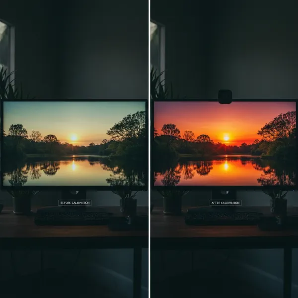 Visual comparison of uncalibrated and calibrated monitor displays, highlighting color accuracy difference.
Understanding Key Calibration Concepts
To effectively calibrate your monitor, it’s crucial to grasp the core concepts that define display output. These parameters work in concert to create the final image you see. Adjusting them correctly is the essence of achieving color accuracy.
Brightness and Contrast
- Brightness (Luminance): This refers to the overall lightness or darkness of your screen. It’s measured in candelas per square meter (cd/m²). An overly bright monitor can wash out colors and hide shadow detail, while a dim one can crush shadows and make colors appear muddy. For critical work like photo editing, a luminance between 80-120 cd/m² is often recommended, adjusted to your ambient lighting.
- Contrast: This is the ratio between the brightest white and the darkest black your monitor can display. Proper contrast ensures that details are visible across the entire tonal range, from deep shadows to bright highlights, without “clipping” (losing detail in pure white or pure black areas). Adjusting contrast correctly helps maintain the dynamic range of an image.
|
Our Picks for the Best Computer Monitor in 2026
As an Amazon Associate I earn from qualifying purchases.
|
||
| Num | Product | Action |
|---|---|---|
| 1 | Amazon Basics 24 Inch (23.8 inch viewable) Monitor, FHD 1080P, Max 100Hz, VESA Compatible, Built-in Speakers, Black |

|
| 2 | KOORUI 22 Inch Computer Monitor Full HD 1080P 100Hz PC Gaming Screen VA Panel Ultra-Slim Display 3000:1 Contrast Ratio with Adpitive Sync (HDMI/VGA/VESA Compatible 100x100mm/Audio Out), Tilt, Black |
|
| 3 | New! Sceptre 27-inch Gaming Monitor 100Hz 1ms DisplayPort HDMI x2 100% sRGB AMD FreeSync Build-in Speakers, Eye Care Frameless Machine Black 2025 (E275W-FW100T Series) |
|
| 4 | Samsung 32-Inch Flat Computer Monitor, 75Hz, Borderless Display, AMD FreeSync, Game Mode, Advanced Eye Care, HDMI and DisplayPort, LS32B304NWNXGO, 2024 |
|
| 5 | Samsung 27\" Essential S3 (S36GD) Series FHD 1800R Curved Computer Monitor, 100Hz, Game Mode, Advanced Eye Comfort, HDMI and D-sub Ports, LS27D366GANXZA, 2024 |
|
| 6 | LG 24U411A-B 24-inch Full HD (1920 x 1080) IPS Computer Monitor, 120Hz, HDR10, Reader Mode, Flicker Safe, HDMI, Slim Stand Base, Black |
|
| 7 | KOORUI 24-inch Computer Monitor Full HD 1920 x 1080p 100Hz VA Display 4000:1 Contrast Ratio with HDMI VGA, TÜV Rheinland Certified, 100 x 100 mm VESA Mountable, Ultra-Slim Design, Tilt, Black, E2412F |
|
| 8 | Philips 221V8LB 22 inch Class Thin Full HD (1920 x 1080) Monitor, 100Hz Refresh Rate, VESA, HDMI x1, VGA x1, LowBlue Mode, Adaptive Sync, 4 Year Advance Replacement Warranty |
|
| 9 | acer 27 Inch Monitor- KB272-27 Inch FHD IPS (1920 x 1080) Display, Up to 120Hz Refresh Rate, 99% sRGB, Tilt, Adaptive-Sync Support (FreeSync Compatible) 1ms (VRB), HDMI & VGA Ports |
|
| 10 | MNN Portable Monitor 15.6inch FHD 1080P USB C HDMI Gaming Ultra-Slim IPS Display w/Smart Cover & Speakers,HDR Plug&Play, External Monitor for Laptop PC Phone Mac (15.6\'\' 1080P) |
|
Color Temperature (White Point)
Color temperature, or white point, determines the “warmth” or “coolness” of the whites on your screen. It’s measured in Kelvin (K).
- A lower Kelvin value (e.g., 5000K or D50) produces a warmer, more yellowish white, often preferred for print matching as it mimics standard viewing conditions for physical prints.
- A higher Kelvin value (e.g., 6500K or D65) results in a cooler, more bluish white, which is the most common standard for web content and general viewing, simulating daylight.
Gamma
Gamma defines the relationship between the input signal and the monitor’s output brightness. Essentially, it controls the mid-tone brightness, impacting how colors and luminosity transition from dark to light. A gamma setting of 2.2 is the industry standard for most PC monitors and is widely adopted for web content and video. An incorrect gamma setting can make images appear too dark or too light, especially in mid-range tones, affecting the perceived contrast and saturation.
Color Gamut
The color gamut describes the full range of colors a monitor can reproduce. Different standards exist to define these ranges:
- sRGB: The most common color space, used widely across the internet, standard monitors, and many digital cameras.
- Adobe RGB: A larger color space than sRGB, capable of displaying a wider range of greens and cyans, often favored by professional photographers and graphic designers for print work.
- DCI-P3: A broad color space commonly used in digital cinema and increasingly found in high-end consumer displays, offering even more vibrant colors than sRGB.
Understanding your monitor’s capabilities and the target color space for your work is crucial for accurate color reproduction.
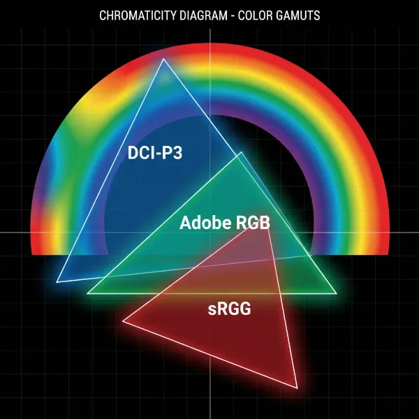 Diagram comparing sRGB, Adobe RGB, and DCI-P3 color gamuts, illustrating their different color ranges.
Tools and Methods for Monitor Calibration
Achieving accurate monitor colors can be approached with varying degrees of precision, depending on your needs and budget. Several tools and methods are available, from simple software adjustments to advanced hardware solutions.
Hardware Calibrators (Colorimeters & Spectrophotometers)
For objectively accurate color, hardware calibration devices are the gold standard. These small devices, such as colorimeters and spectrophotometers, attach to your screen and work with specialized software to measure the color output. They then create a custom color profile (ICC profile) that optimizes your display for its specific characteristics and even your room’s ambient lighting.
- Colorimeters like the Datacolor SpyderX or X-Rite ColorMunki Display are excellent for display calibration.
- Spectrophotometers (e.g., X-Rite i1Pro) are more versatile, capable of measuring both emissive displays and reflective surfaces (like prints), offering the highest level of accuracy for critical color management.
These tools are highly recommended for anyone involved in professional photo editing, graphic design, or any color-critical work, as they eliminate subjective human perception from the calibration process.
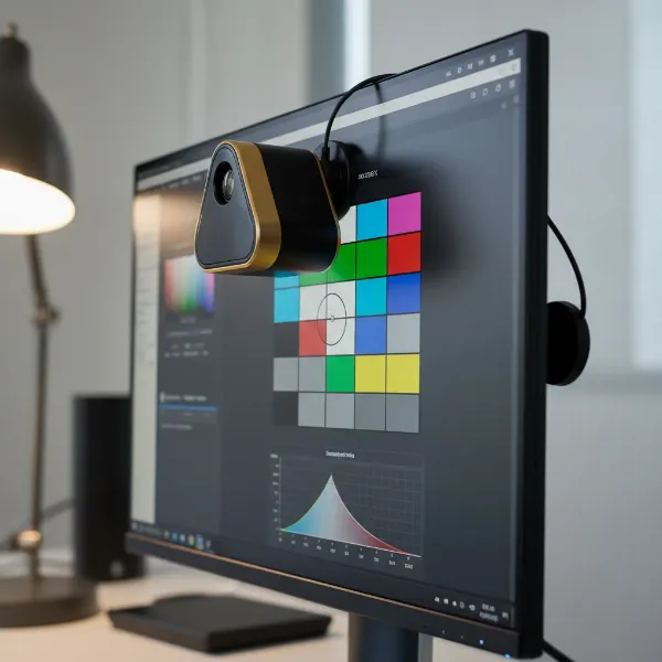 A colorimeter device attached to a monitor screen, performing hardware calibration for color accuracy.
Software Calibration (Operating System Tools)
Many operating systems include built-in utilities for basic monitor calibration. While these tools are more subjective as they rely on your eye, they can significantly improve color accuracy compared to an uncalibrated display.
- Windows Color Calibration: Accessible via Control Panel > Color Management > Advanced > Calibrate Display. This wizard guides you through adjusting gamma, brightness, contrast, and color balance using visual patterns.
- macOS Display Calibrator Assistant: Found in System Settings > Displays > Color. Similar to Windows, it walks you through visual adjustments to create a new display profile.
These software-only solutions are a good starting point for users who don’t require professional-grade accuracy or have a limited budget.
Online Calibration Tools (Visual Guides)
Several websites offer free, visual-based calibration guides. These tools typically present test patterns and instructions for you to manually adjust your monitor’s On-Screen Display (OSD) settings (brightness, contrast, color temperature) and your graphics card settings. Websites like Lagom LCD Monitor Test Pages are popular examples. While convenient and free, these methods are the least accurate because they depend entirely on your subjective perception, which can vary greatly. They are best suited for quick, minor adjustments or for users who simply want to improve their monitor’s visual output without specialized equipment.
Step-by-Step Guide to Monitor Calibration
Regardless of the method you choose, a structured approach will yield the best results for accurate colors. Here’s a general step-by-step guide:
Before You Begin: Preparation Steps
Preparation is key to a successful calibration.
- Warm-up: Turn on your monitor at least 30 minutes before calibration. This allows the display to reach its stable operating temperature and ensures consistent color output.
- Ambient Lighting: Calibrate in the lighting conditions typical of your work environment. Avoid direct sunlight or strong artificial lights shining on your screen. Neutral, indirect ambient light is ideal to minimize reflections and interference.
- Clean Your Monitor: Ensure your screen is free from dust, smudges, or fingerprints that could affect color perception.
- Reset Factory Defaults: Before starting, reset your monitor to its factory default settings via its On-Screen Display (OSD) menu. This provides a clean slate for calibration.
- Native Resolution: Ensure your monitor is set to its native resolution for optimal image quality.
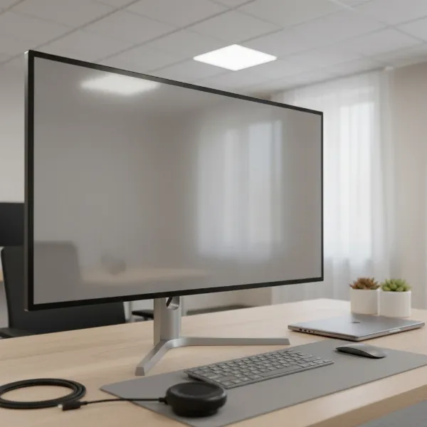 A tidy workspace with a clean, warmed-up monitor, ready for the calibration process.
Using a Hardware Calibrator
For the most accurate results, a hardware calibrator is essential.
- Install Software: Install the software that came with your colorimeter (e.g., Datacolor Spyder software, X-Rite i1Profiler).
- Monitor Warm-up & Setup: Perform the preparation steps above.
- Place Device: Attach the calibrator to the center of your monitor screen as directed by the software.
- Software Settings: Follow the software’s prompts. You’ll typically be asked to specify:
- White Point Target: Usually D65 (6500K) for general use, or D50 (5000K) for print.
- Gamma Target: Usually 2.2.
- Luminance Target: Often between 80-120 cd/m² for photo editing, adjusted to ambient light.
- Color Gamut: sRGB, Adobe RGB, or DCI-P3, depending on your workflow and monitor capabilities.
- Run Calibration: The software will display a series of colors and patterns, while the device measures them and creates an accurate ICC profile.
- Save Profile: Once complete, save the generated ICC profile. Your operating system will automatically use this profile to ensure accurate color display.
Calibrating with Software Tools (e.g., Windows Color Calibration, macOS Display Calibrator Assistant)
These built-in tools offer a more accessible, though less precise, method.
- Access Tool: On Windows, search for “Calibrate display color” in the Start menu. On macOS, go to System Settings > Displays > Color, then click “Calibrate…”
- Follow Prompts: The wizard will guide you through a series of steps:
- Gamma: Adjust a slider until the small dot in the center of the test pattern blends with the background.
- Brightness & Contrast: Use your monitor’s OSD controls to adjust brightness and contrast. The goal is to see detail in both light and dark areas of the test patterns without them blending into pure white or pure black.
- Color Balance: Adjust red, green, and blue sliders to remove any color cast from gray tones, making them appear neutral.
- Create Profile: The tool will create and save a new display profile based on your visual adjustments.
Manual Calibration: Adjusting OSD Settings
Even without dedicated software, you can make significant improvements using your monitor’s On-Screen Display (OSD) menu.
- Picture Mode: Start by selecting a “Standard” or “User” picture mode, avoiding “Vivid” or “Game” modes which can oversaturate colors.
- Brightness: Adjust until white appears bright but not glaring, and black retains detail without being crushed.
- Contrast: Fine-tune to ensure a good range of tones from dark to light.
- Color Temperature: Most monitors offer preset color temperatures like 6500K, 9300K, or “User” modes. Choose 6500K for a neutral white. If a “User” mode is available, you can adjust individual RGB gains to achieve a neutral white point using a reference image.
It’s important to note that manual calibration is highly subjective and provides only approximate accuracy.
Best Practices for Maintaining Accurate Colors
Calibrating your monitor is not a one-time event. To maintain consistent and accurate colors over time, implement these best practices:
- Regular Re-calibration: Monitors drift in color and brightness over time. Re-calibrate your display periodically—every 4-6 weeks is a good general guideline, or more frequently if you notice color shifts or before starting an important color-critical project. Older monitors or those with heavy use may require more frequent calibration.
- Consistent Environment: Always work in consistent ambient lighting. Changes in room lighting can significantly alter how you perceive colors on your screen. Avoid direct light shining on your monitor.
- Monitor Warm-up: Continue the practice of warming up your monitor for at least 30 minutes before any color-critical work.
- Log Calibration Dates: Keep a record of your calibration dates and settings. This helps track performance and ensures consistency if you need to revert to a previous profile or troubleshoot issues.
- Monitor Cleaning: Regularly clean your monitor screen to remove dust and smudges that can affect perceived color. Use a soft, lint-free cloth specifically designed for electronics.
- Utilize Color Management: Ensure your operating system and any creative software (e.g., Photoshop, Lightroom) are properly configured to use your calibrated ICC profiles.
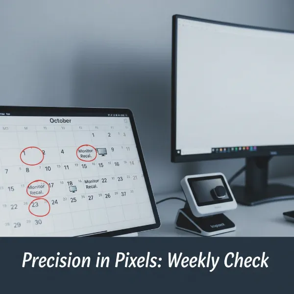 Calendar highlighting consistent dates for monitor recalibration to maintain color accuracy.
Common Calibration Challenges and Solutions
Even with the right tools, you might encounter issues during calibration.
- Inconsistent Results: If calibration results vary wildly, check your ambient lighting. Inconsistent light is a major cause. Also, ensure your monitor is fully warmed up.
- Difficulty Matching Print: If prints don’t match your screen, consider your white point. Print viewing conditions often simulate D50 (5000K), while screens default to D65 (6500K). Calibrating your monitor to D50 for print work can help. Also, ensure your printer and paper profiles are accurate.
- Monitor Limitations: Not all monitors can achieve perfect color accuracy. Entry-level displays or those with limited color gamuts might not be able to hit target color spaces like Adobe RGB. Understanding your monitor’s specifications helps manage expectations.
- Hardware Malfunction: If a hardware calibrator consistently gives error messages or wildly inaccurate readings, try cleaning its sensor or checking for software updates. In rare cases, the device itself might be faulty.
“True color accuracy isn’t just about what you see on your screen; it’s about translating that vision consistently to every output, whether it’s another display or a physical print. A solid calibration workflow is the foundation of dependable visual work.” – John Smith, Senior Color Scientist at Imaging Solutions Inc.
Conclusion
Achieving accurate colors on your monitor is a critical step for anyone dealing with visual content. From ensuring your creative work appears as intended to simply making your online shopping more reliable, monitor calibration bridges the gap between digital representation and real-world perception. By understanding key concepts like brightness, gamma, and color temperature, and utilizing the right tools—from sophisticated hardware calibrators to built-in software—you can elevate your visual experience. Remember that calibration is an ongoing process, not a one-off task; regular adjustments and a consistent environment are vital for maintaining fidelity.
What immediate changes have you noticed after calibrating your monitor, and how has it impacted your daily workflow or creative projects?
Frequently Asked Questions
How often should I calibrate my monitor?
For general use, calibrating every 2-4 weeks is recommended. For color-critical professionals, a weekly or bi-weekly calibration, or before starting any new important project, ensures optimal accuracy due to natural display drift over time and environmental changes.
Can I calibrate my laptop screen?
Yes, laptop screens can be calibrated using the same methods as desktop monitors, including hardware calibrators or built-in operating system tools. However, laptop screens generally have less control over settings and may not achieve the same level of accuracy as high-end external monitors.
What is the ideal color temperature for photo editing?
The ideal color temperature for photo editing typically depends on your workflow. For web and general digital viewing, D65 (6500K) is standard. For matching prints, D50 (5000K) is often preferred as it simulates the color temperature of daylight-balanced viewing booths.
What is an ICC profile?
An ICC (International Color Consortium) profile is a data file that describes a device’s color characteristics, such as your monitor’s specific color gamut and response. When you calibrate your monitor, a custom ICC profile is created to ensure accurate color reproduction across your system and applications.
Is hardware calibration truly necessary?
While software and manual calibration can offer improvements, hardware calibration using a colorimeter or spectrophotometer is truly necessary for objectively accurate colors. It removes subjective human perception, providing precise measurements and creating a highly accurate custom ICC profile essential for professional color-critical work.